gridslide.js

A multidirectional image slider jQuery plugin

Grid Navigation

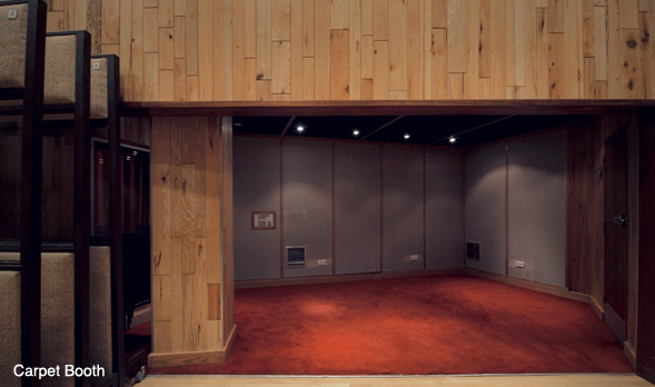
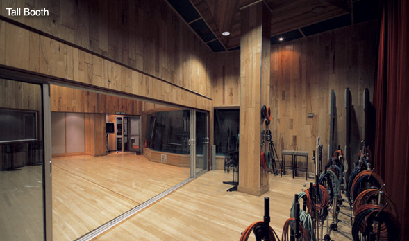
With minimal setup gridslide will take your images and create a grid like navigation below the slider.

  • image
  • image
  • image
  • image
  • image
  • image
  • image
  • image
  • image
  • image
  • image
  • image
  • image
  • image
  • image

Gridslide can also be configured to include titles for each layer of the grid by simply including a data attribute with each group of images.

Simply use the options below when calling the plugin in your scripts file to recreate the above demo, don't foreget to check out the documentation.

If you'd prefer not to use images as your navigation icons you can just leave out the imgGrid option when you call the plugin. This will create just a standard grid that you can manipulate with css to the effect of a grid of button like links.

	$('.slider').gridslide({
		imgGrid: true,
		title: true
	});

Classic Navigation With Buttons

If you prefer you can just use standard directional buttons to control the slider. This is the functionality you regularly see in many other sliders.

  • image
  • image
  • image
  • image
  • image
  • image
  • image
  • image
  • image
  • image
  • image
  • image
  • image
  • image
  • image

Gridslide automatically creates the navigation links for you all you have to do is style them and place them where you like.

Configuring the plugin to display this way is as simple as passing the menu option with the 'nav' setting when you call the plugin within your scripts file as shown below. You can see that I've also set the speed option to half a second.

	
	$('.slider2').gridslide({
		menu: nav,
		speed: 500
	});

Setting Up GridSlide

HTML

CSS

JS

OPTIONS

The HTML to setup for this plugin is very simple.

Just create a unordered list for each level of images and contain each individual image within a list element. That's it!

If you'd like to have have a title for each level of images when using grid navigation that just specify the title by attaching a data-title attribute to the <ul> and choose a name! You can see it in my example to the right where I choose the names Studio 1, Studio 2, Studio 3. Now with a few simple settings when you call the plugin you can have it the exact same way as above.

Check the JS tab above for an explanation of these settings.

You also want to set an area underneath your slider div for the navigation. By default the plugin looks for a div with the id of slider-nav but you can override this in the options.

<div class="slider">
	<ul data-title="Studio 1">
		<li><img src="img/stu1_1.jpg" alt="image"></li>
		<li><img src="img/stu1_2.jpg" alt="image"></li>
		<li><img src="img/stu1_3.jpg" alt="image"></li>
		<li><img src="img/stu1_4.jpg" alt="image"></li>
		<li><img src="img/stu1_5.jpg" alt="image"></li>
		<li><img src="img/stu1_6.jpg" alt="image"></li>
	</ul>

	<ul data-title="Studio 2">
		<li><img src="img/stu2_1.jpg" alt="image"></li>
		<li><img src="img/stu2_2.jpg" alt="image"></li>
		<li><img src="img/stu2_3.jpg" alt="image"></li>
		<li><img src="img/stu2_4.jpg" alt="image"></li>
		<li><img src="img/stu2_5.jpg" alt="image"></li>
	</ul>

	<ul data-title="Studio 3">

		<li><img src="img/stu3_1.jpg" alt="image"></li>
		<li><img src="img/stu3_2.jpg" alt="image"></li>
		<li><img src="img/stu3_3.jpg" alt="image"></li>
		<li><img src="img/stu3_4.jpg" alt="image"></li>
	</ul>
</div>


<div id="slider-nav">

</div>
				

The CSS to setup gridslide like you see above is again very simple. First we add some styling to our slider div. You want to make this the same width and height as your images are. Add overflow scroll to allow visitors to your site access to all the images if they dont or can't have javascript enabled.

For each of the unordered lists within our slider div we want to make sure that they are all uniform. We remove any list styling and set padding and margin to 0 to ensure we have no gaps.

As each image is within its own li tag we can just float every li tag in the slider div to the left. This will line each of your images up side by side within their respective ul.

Next we want to style the navigation area. If you choose to use grid navigation in the options the plugin will create a grid nav div within your specified navigation div. Check the HTML tab for a description of this.

We set our grid nav div here to be 100% width so it fills your specified navigation area. We also clear each ul so that they each have their own line when we float them.

Next we remove all list styling and float each of the grid nav list elements to the left. The other settings are optional and you can play around with them. As I am using the img grid navigation option here I have set each li to the height we would like each of our mini images to appear.

We set the height and width that we would like our images to appear in our navigation by directly setting the width and height of .grid-nav-layer li img.

Last but not least when your user clicks a box within the grid navigation the plugin will automatically apply a css class named grid-active. The styling of this is completely up to you but for this demonstration I just apply a white background to the element selected. This combined with the padding on our li elements creates a white border around our selected element.

The plugin comes with these styles as default in a custom CSS file named gridslide.css, original huh?. You can change the styles however you like or just use them as a reference for your own CSS. Make sure to include the CSS file within your head tags if you intend to use the default styling.

.slider{
	width: 589px;  
	height: 348px;
	overflow: scroll;
}

.slider ul{
	position:relative;
	list-style: none;
	padding:0;
	margin:0;
}

.slider li{
	float: left;
}

.grid-nav{
	width: 100%;
}

.grid-nav ul{
	clear:both;
}

.grid-nav-layer li{
	list-style: none;
	float:left;
	cursor: pointer;
	height:54px;
	padding:2px;
	border:1px solid #fff;
	margin:3px;
}

.grid-nav-layer li img{
	height:54px;
	width:87px;
}

.grid-active{
	background-color: #fff;
}


Include the plugin file as you would normally, either within your head tags or at the foot of the page.

Then call the plugin on the container div and pass your options. Remember to use $(window).load(function(){}); as you need to initialise the plugin AFTER all of your images have loaded. I may add a preload feature in the future but for now this should avoid any issues with initialisation.

You can see that there I override menu, imgGrid, title and speed settings. For a complete listing of the options this plugin offers please check the options tab above.

The settings to the right will allow you to use the plugin as seen in the first demo on this page.

<script src="gridSlide.js"></script>


<script>
	$(window).load(function(){
			
			$('.slider').gridSlide({
				menu: 'grid',
				imgGrid: true,
				title: true,
				speed: 500
			});
		});
</script>


In the code example you can see the list of default options for this plugin.

The nav option lets you specify the div that you would like your navigation appear in. If you wanted my nav to appear in a div with the class navhere for example you would just pass a string with the selector like so '.navhere' as the nav option when you called the plugin. Simple.

The menu option has two possible options. Either the grid option as demoed above or the 'nav' option as demoed in the example below.

The title option is only used when you have your navigation option set to grid. It allows you to attach a data attribute to each ul tag named title that will be used as the title for a row in your navigation as shown above.

The imgGrid option again is only valid when you choose grid navigation. It makes the plugin add smaller versions of each image you have chosen into your navigation as selectors or buttons for your user. This option is set to false by default so that you can make simple buttons or elements with pure css and no images.

Last but not least the speed option. Does exactly what you expect, it controls the speed of the animation when you move images. The number follows the jQuery convention so you can specify keywords such as 'fast' or 'slow' or a value in milliseconds. The default is 300 milliseconds.

If you would like to see more options then get in touch over at my or fork/raise an issue over on the Github page


					nav: '#slider-nav',
					menu: 'grid',
					title: false,
					imgGrid: false,
					speed: 300
				

Download GridSlide